

Strategic Rebrand of a Fast-Casual Identity for Haven Chicken

BrandING, Store Design, Website Design, Clothing & Merchandise, Packaging Design, 3D CAD Rendering, Omni-Channel MarketingHaven Hot Chicken built a loyal following as one of New England's first fully dedicated Nashville hot chicken concepts. Ajnci partnered with the brand to orchestrate a holistic overhaul of their visual identity, digital presence, and in-store customer experience, preparing the beloved local start-up for aggressive national expansion.
CHALLENGE
Despite serving an exceptional, high-quality product, the brand's visual identity failed to encapsulate the premium nature of its food. The original branding suffered from generic elements and mismatched logos that caused confusing visual inconsistencies across platforms. In a fiercely competitive market dominated by legacy heavyweights and emerging niche-spice players, the client's ask was to rapidly elevate their brand perception, transitioning Haven Hot Chicken from a local favorite into a scalable, nationally recognized powerhouse.
RESULTS
Ajnci’s strategic intervention successfully unified Haven Hot Chicken's brand identity across all digital, print, and physical touchpoints. By streamlining the menu and introducing an intuitive "Natural Heat Spectrum," our operational expertise significantly reduced customer ordering anxiety and improved service flow. Ultimately, the enhanced store decor and optimized operations established a highly scalable, premium blueprint ready for franchise growth.

Haven Hot Chicken is a Connecticut-based, fast-casual restaurant concept and a pioneer of Nashville-style hot chicken in New England. They specialize in serving 100% Halal-certified chicken and vegetarian options that span a wide spectrum of heat levels—ranging from "Natural" (no spice) to extremely spicy—all complemented by traditional southern sides.

APPROACH
BRANDING
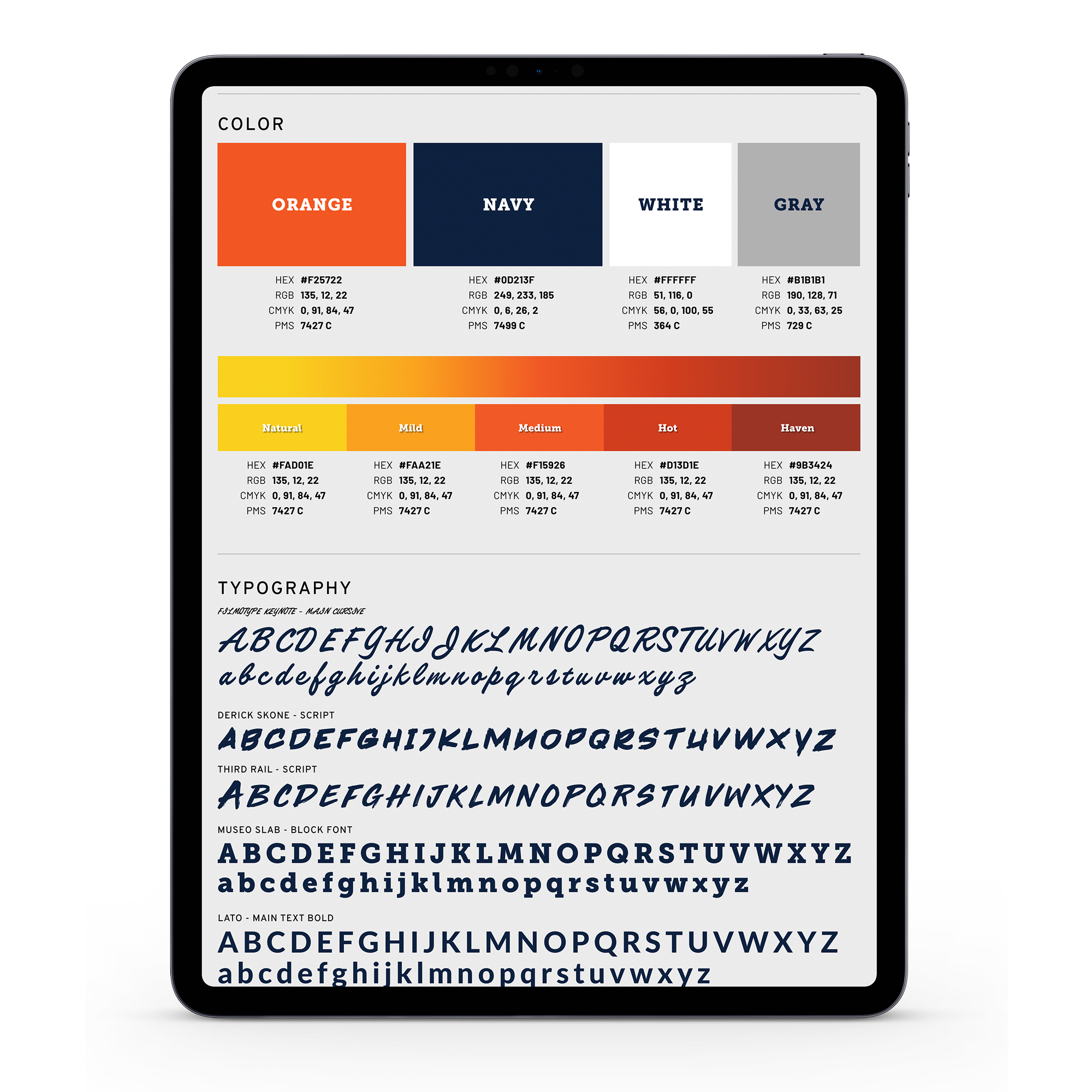
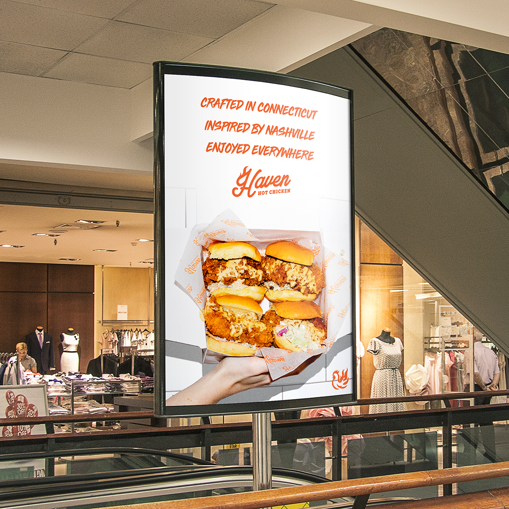
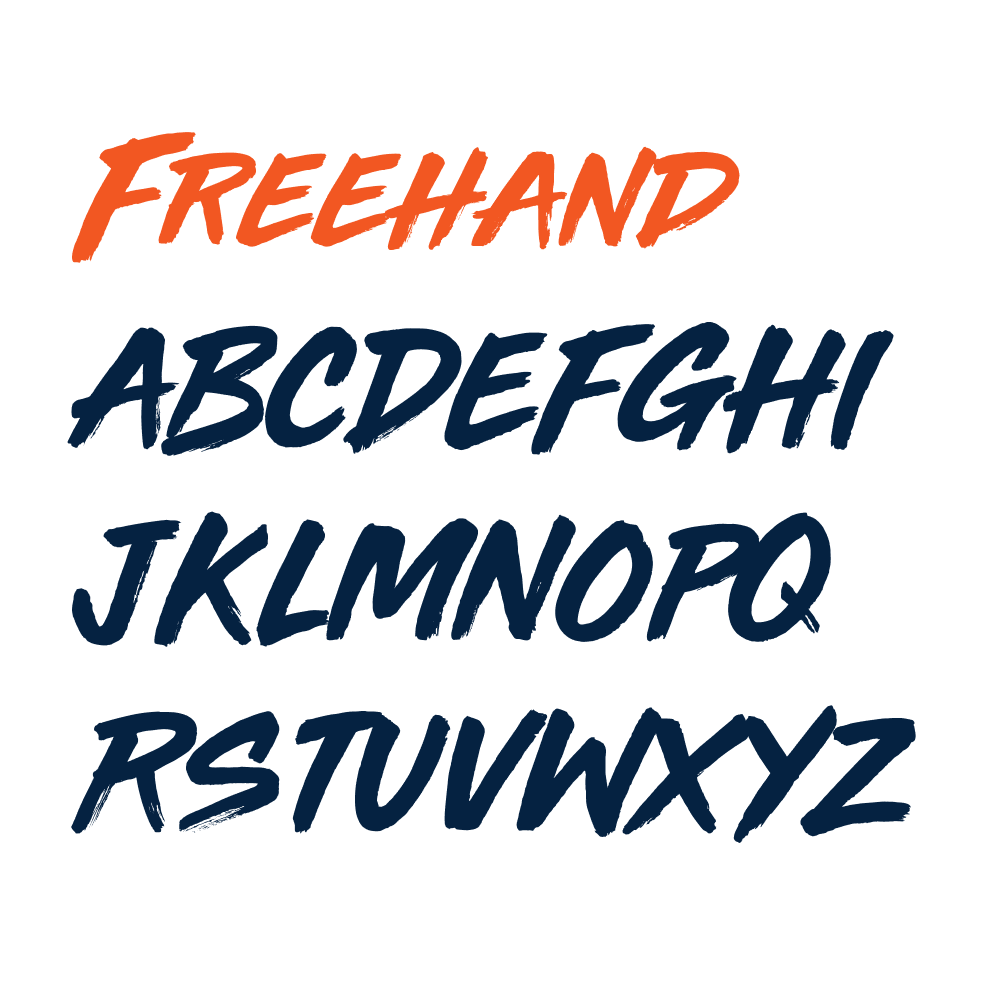
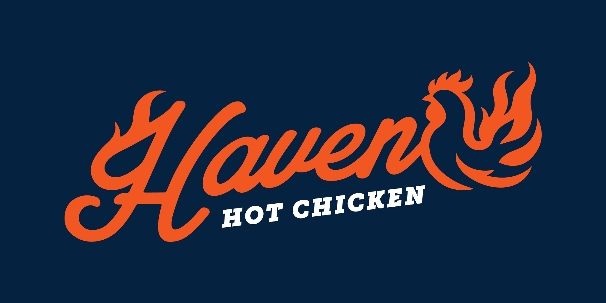
We overhauled the brand's visual identity to reflect a refined, premium aesthetic. We traded their mismatched icons for a unified, modern logo system, pairing a clean script font with a sleek "fire chicken" symbol and integrating a subtle flame detail into the "H". To differentiate Haven from the sea of red typical in hot chicken branding, we introduced a distinct color palette featuring bright orange, navy, and gray—a creative nod to their Connecticut roots and Yale's influence.


APPROACH
WEBSITE
We designed a custom, intuitive website that breaks away from templated food service layouts. The new digital hub leverages our updated color palette, striking food photography, and streamlined navigation to highlight the brand's authentic story while making online ordering completely frictionless for the user.


APPROACH
CLOTHING
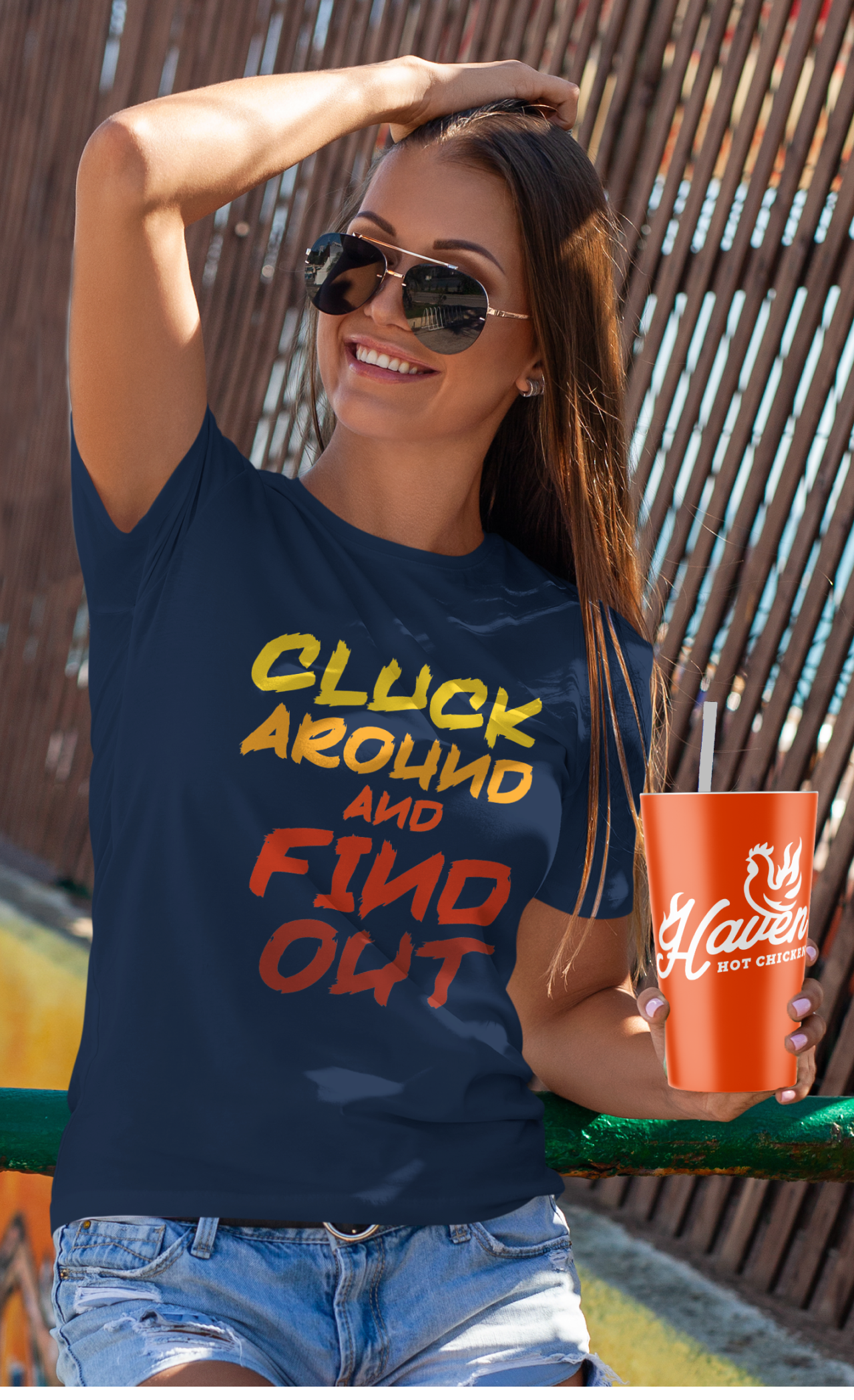
To cultivate community and brand advocacy, we launched a fashionable "Lifestyle Collection". Featuring branded t-shirts, hats, and functional gear, the collection empowers fans to become walking brand ambassadors through bold, tongue-in-cheek slogans like "Cluck Around & Find Out".


APPROACH
DESIGN
Our comprehensive design services extended to both packaging and the physical store environments. We redesigned the packaging with bold orange and white designs, utilizing clean iconography to prioritize an unforgettable unboxing experience. For the physical locations, we transformed the decor to balance modern fast-casual optimization with warm, rustic comfort, integrating custom woodwork, functional seating, and vibrant murals painted by local artists to celebrate Connecticut's history.


APPROACH
3D CAD
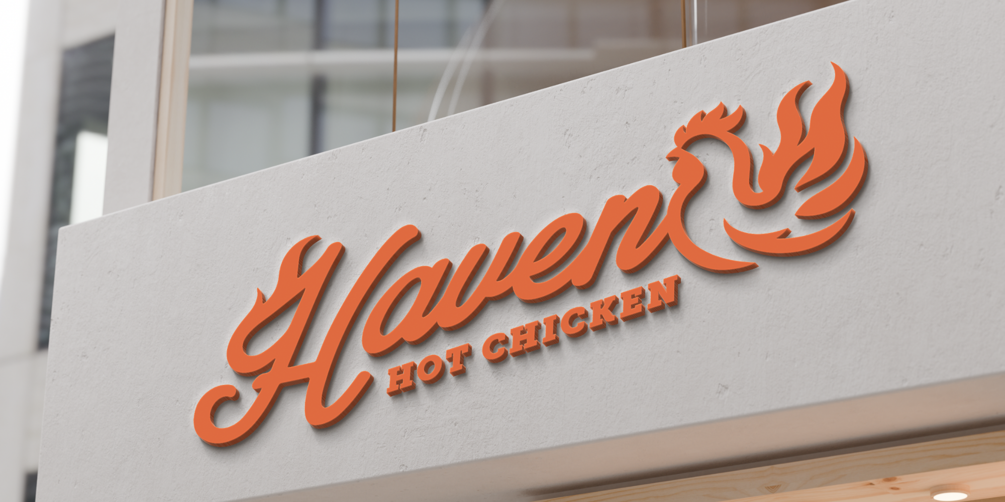
To seamlessly bridge the gap between concept and reality, we utilized 3D CAD modeling and rendering to pre-visualize the physical store transformations and custom signage before execution. These detailed visualizations allowed us to present the vibrant orange exterior facade and the illuminated fire chicken logo to the client, ensuring the spatial layout and bold new aesthetic were perfectly integrated into the fast-casual dining environment before construction began.


